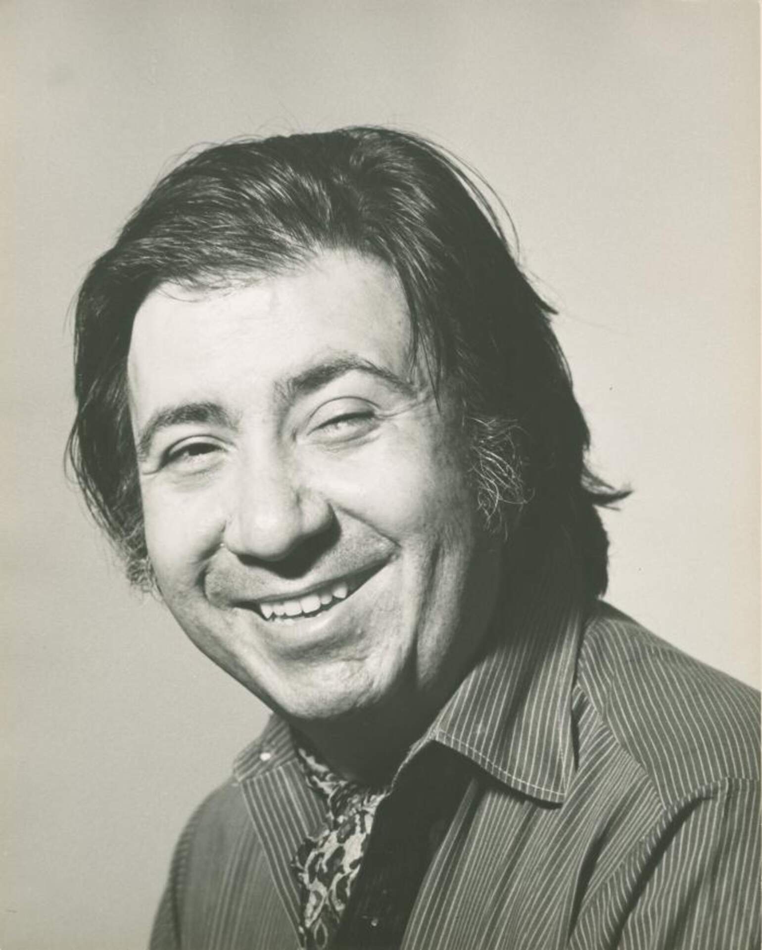
Emil Antonucci
(1929-2006)
Born: Brooklyn, New York
Emil Antonucci was a graphic designer, artist, and illustrator. Born in Brooklyn, New York to Italian immigrants, Antonucci attended Cooper Union Art School, graduating in 1950. Immediately after his schooling, he primarily worked as a freelance illustrator and book designer while publishing Beat poets like Robert Lax on his small presses, The Hand Press and Journeyman Press, located in New York.
The 1950s proved to be a fruitful decade for Antonucci, contributing to prominent public spaces and institutions across New York City. In 1958 he received a Guggenheim Fellowship and, in the following year, designed and published a book for fellow Artpark artist and good friend, Robert Lax, titled The Circus of the Sun. However, it was his first major commission, the 1959 logo design for the Four Seasons Restaurant, that brought him to further prominence – working alongside such luminaries of modern design as Philip Johnson, Mies van der Rohe, Ada Louise Huxtable, Richard Lippold, and Marie Nichols. Four trees representing each of the seasons depict the restaurant’s name, rendered with organic lines reminiscent of woodblock printing. “You can overcome banality with style. But the style in those years was geometric, hard-edged like the CBS eye, I didn’t want a hard edge” Antonucci explained to New York Magazine.
After taking part in this design dream-team, Antonucci was hired by Johnson to create the logos of his NY State Pavilion–part of the 1964 NY World’s Fair, as well as the logo and sign of Bobst Library at NYU. Antonucci would later design much of the signage found on the NYU campus, as well as signs, maps, information kiosks, and logos found in various locations such as: Union Square, Greenwich Village, Times Square, Parsons, Carnegie Hall, and the Lincoln Center. [1]
Antonucci sought to introduce Catholic art and graphics into the American mainstream. He contributed drawings to New York’s Catholic Worker newspaper and Jubilee magazine. However, it was at the liberal Catholic magazine, Commonweal, where Antonucci found the biggest impact. Antonucci was commissioned to redesign Commonweal in the latter part of 1964, during the months when the journal marked its 40th anniversary. The new design appeared at the beginning of 1965. He believed that the magazine needed contrast and distinctiveness. He provided it in three ways: the use of a bolder font for news heads; a “signature” line of black bullets to mark off sections of the magazine and accompany the heads; and a re-rendering of many of the existing line drawings in strong silhouette or white-on-black scratchboard art. [2] He then changed the name of the journal from “The Commonweal” to simply “Commonweal,” appearing on the cover. He again redesigned the magazine in 1987. “I see art as the creation of structures, the creation of worlds that meaning may inhabit, but not defined,” he once wrote in Commonweal. “I see the way art works as an analog of God’s presence in the world.”
It was then from 1974-1976 that Antonucci teamed up once again with Robert Lax, this time at Artpark. This long-lasting collaboration between the two continued for the next few decades under Journeyman Press, an experimental printing house that Antonucci had set up. Acknowledging the significance of the collaboration, Lax dedicated his 1997 book, A Thing That Is, with this inscription: “for / Emil Antonucci, / whose / Journeyman Press / began / it / all.” While running Journeyman Press as his art practice, Antonucci also taught graphic design at Parsons School of Design for over 40 years. Over a five-decade long career, Antonucci went from illustrating book covers to designing annual reports and corporate identities for organizations like the American Society of Composers, Authors and Publishers, and the Times Square Business Improvement District. Antonucci passed away in 2006.
[1] http://newschoolhistories.org/nsarchives/emil-antonucci-designing-new-york/
[2] https://www.commonwealmagazine.org/remembering-emil-antonucci-and-commonweal
